7 Eleven Website Redesign Concept
7 Eleven Homepage
Current Problem
The 7 Eleven homepage consists of a stagnant images, carousels and tiles. The layout is not mobile friendly and it forces customers to search for useful content. With the exception of the logo the 7 Eleven brand is not apparent anywhere on the homepage
Opportunity
The 7 Eleven homepage consists of a stagnant images, carousels and tiles. The layout is not mobile friendly and it forces customers to search for useful content. With the exception of the logo the 7 Eleven brand is not apparent anywhere on the homepage
Current 7-Eleven Homepage Assessment
The 7 Eleven homepage consists of a mixed bag of stagnant images, carousels and tiles. Some of the biggest culprits with the current format is the lack of direction, brand identity and/or brand awareness throughout the homepage. The heroshots are day parted and serve no real purpose outside of providing a visual depiction of what ‘may’ be available at a local 7 Eleven location throughout the day. In addition the featured national deals are located to the side in the right rail. This can be problematic because the deal information is not readily available or easy to find without customers having to scroll on the page which is especially problematic on mobile. The featured deals are a huge revenue source for 7-Eleven and should have more prominent real estate on the website. In addition each deal is contained within a tile with a Find A Store CTA located at the bottom of each tile. This feature leads customers to a dead-end experience as it prevents them from geolocating the specific deals by store location.
The homepage has two other sections; one where there is a carousel of content and the other where there is a stagnant tile. The carousel content area poses it own challenges/risks because it is locating in an area of the page where carousels typically are not viewed. In addition according to my research carousels have proven to not provide a lot of SEO value because the likelihood for a customer to overlook carousel information is high due to it’s design . Furthermore, in the current state the stagnant tile features a program or service specific to customer’s location. However the size of this tile and the carousel is too big which causes the content areas to look spartan in both applications.
Research Link:
Why Homepage Carousels Are Bad (& 3 Alternatives to Try Instead)
https://www.impactbnd.com/blog/why-homepage-carousels-are-bad
Recommendations
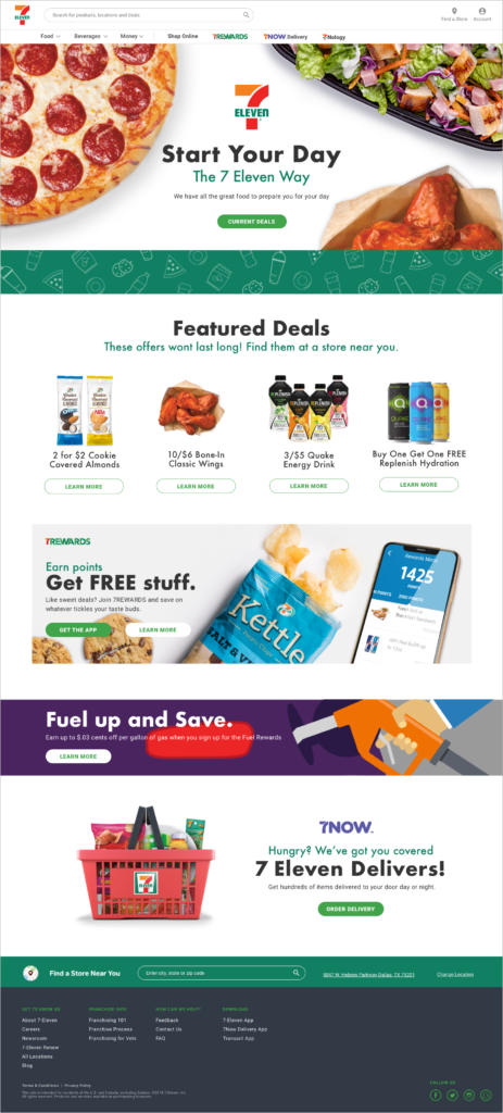
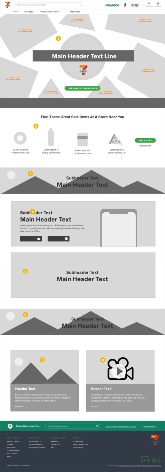
- New hero section with high resolution imagery of 7 Eleven branded product. Since the hero is the first thing customers see when accessing a website it is important to make a big splash with your brand to get customers familiar with the types of products/services you sell. A CTA can take customers to all of the 7 Select branded products which would be another huge brand play.
- Featured deals section now relocated up under the hero which add prominence and a sense of hierarchy to the page. This should also help increase traffic and sells for the stores.
- This banner section is reserved for any national deal that 7 Eleven would like to promote such as a strategic partnership with Warner Bros. the Cowboys or the like.
- This is a new tiled section that features any ongoing corporate promotions 7 Eleven would like to highlight ie., 7Rewards app features, 7Now app features updates. This section replaces the existing carousel and ensures that customers will have a greater chance of seeing the information that 7 Eleven is communicating. The idea behind this tile is that it can be combined with the tile below it to create one large tile or big promotion or it can be left as two separate tiles.
- This is a new tiled section that features any ongoing corporate promotions 7 Eleven would like to highlight ie., 7Rewards app features, 7Now app features updates. This section replaces the existing carousel and ensures that customers will have a greater chance of seeing the information that 7 Eleven is communicating. The idea behind this tile is that it can be combined with the tile below it to create one large tile or big promotion or it can be left as two separate tiles.
- This banner section is reserved for any national deal that 7 Eleven would like to promote to help drive more store traffic, or create brand awareness.
- This section is dedicated to the 7 Eleven blog. 7 Eleven has very rich and long history and I think that it is important to leverage this unique characteristic through featuring articles that speaks to the brand’s history. This would also serve as an entry point to the dedicated blog page.
- According to research most consumers are likely to become a repeated customers of a brand if they share some relatable characteristics. A featured video of real customers who discuss why they like and appreciate the 7 Eleven brand can capture the true essence of what it means to be a 7 Eleven customer and maybe change perceptions in the process.
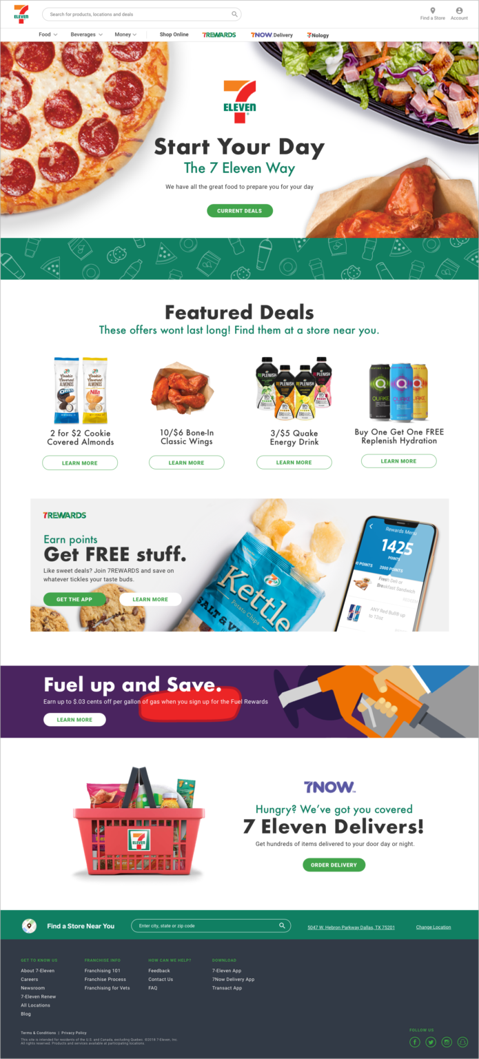
Homepage Redesigned – Desktop (variation)
Homepage – Mobile

Impressions
I captured the results from the customer focused A/B testing we conducted on the existing homepage (orange) and the newly redesigned homepage (green). Out of a sample size of 20 customers all of the customers favored the new design over the existing one.
Product Geolocation Flow
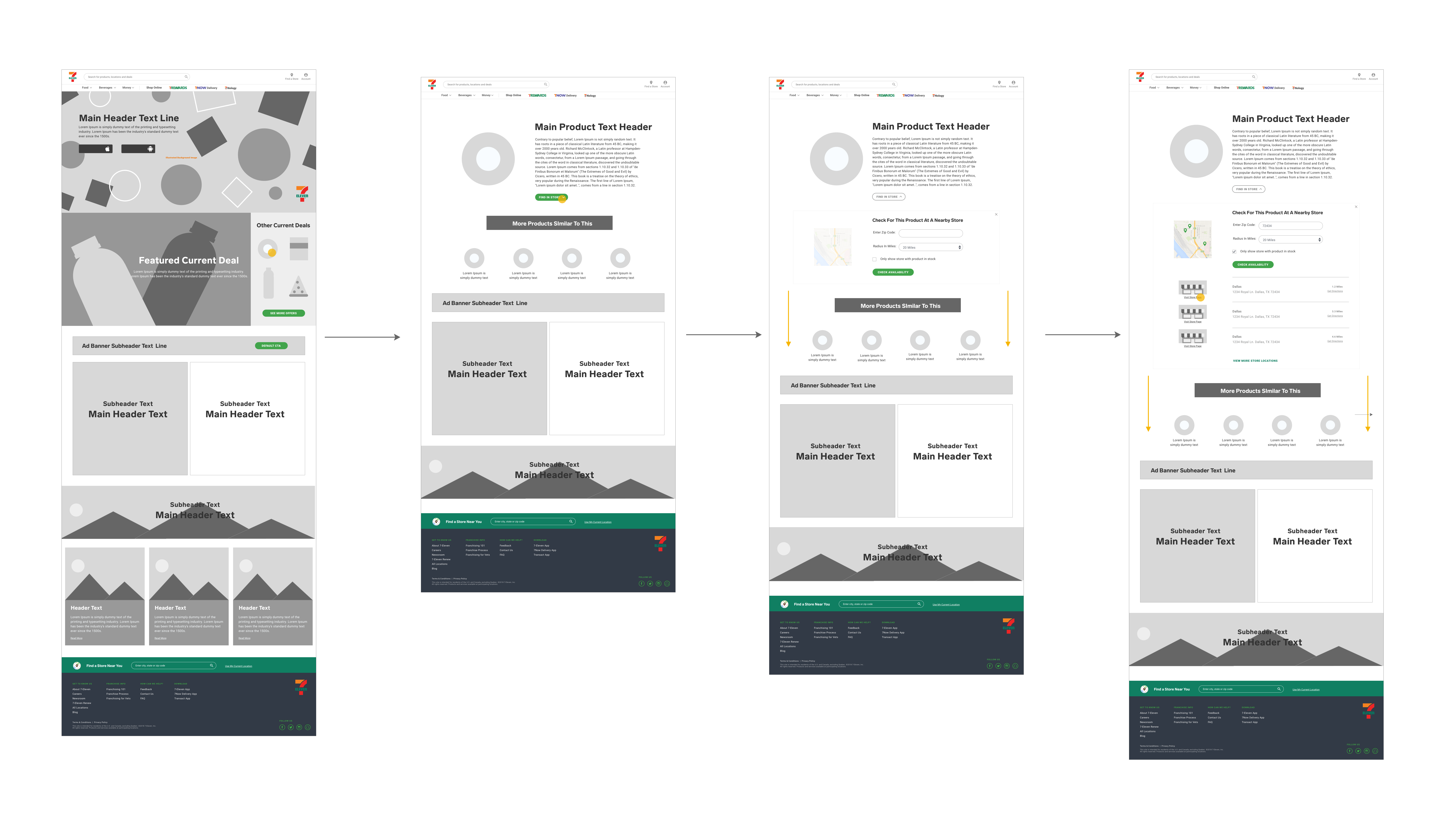
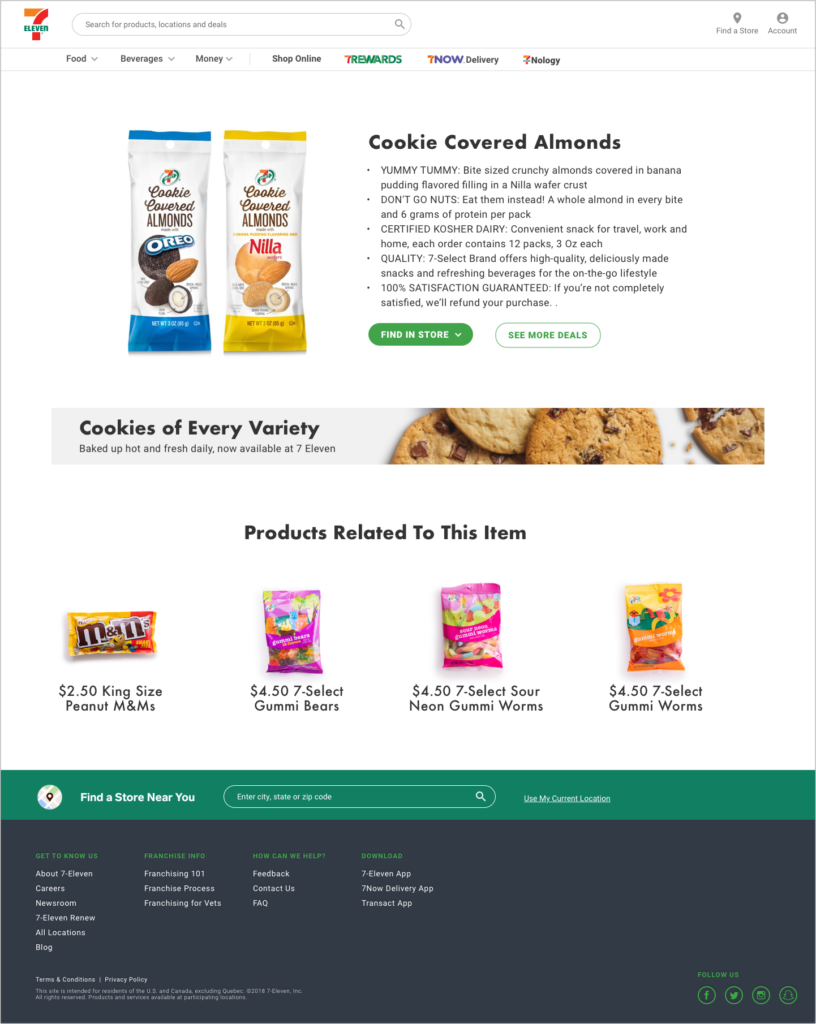
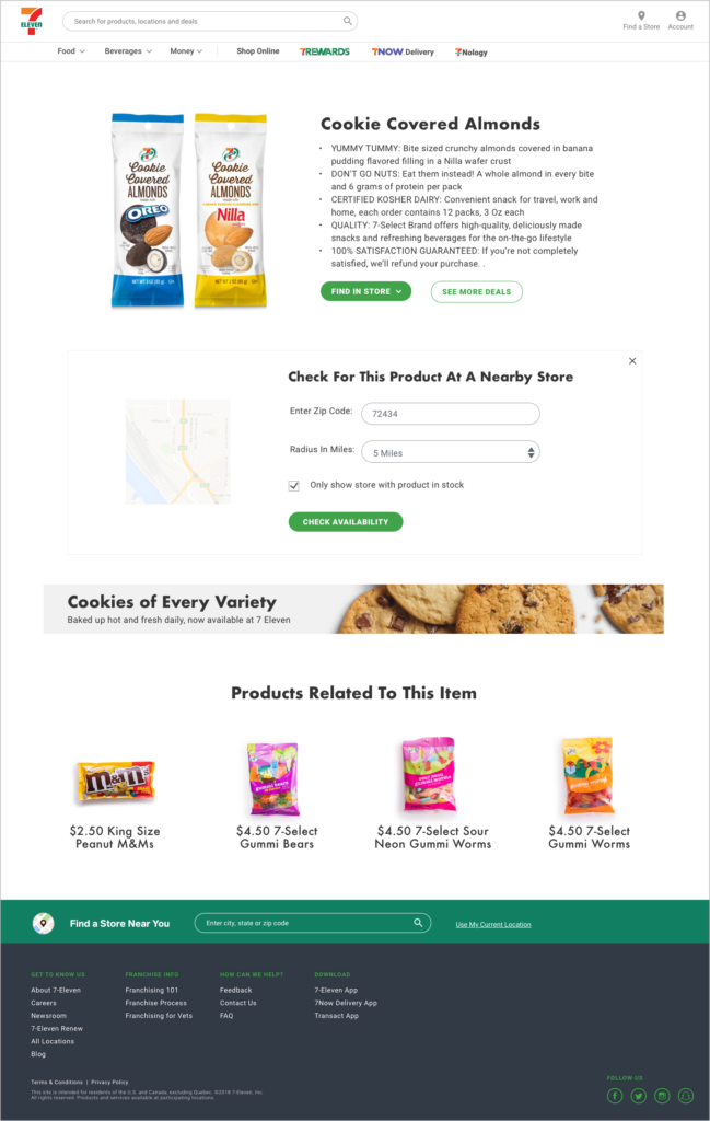
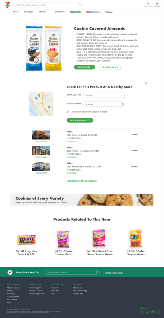
One of the biggest opportunities I found to improve the 7-Eleven.com experience was through giving customers the ability to find featured products locally at a 7-Eleven store. Through this journey customers can select a product of interest from the homepage. From there they are redirected to the product page where they can learn more information about the product and locate the closest 7-Eleven stores with that item in stock. I did some usability testing on this journey with actual 7-Eleven customers and the insights I gathered were favorable as most customers liked the convenience and seamless process of locating various products on the website.
