eSelfserve HR Admin Portal UI Refresh

As apart of my UX freelance work I’m presented with a range of product challenges and requests. I enjoy this type of work because I can never anticipate the type of project will land on my desk. In my experiences I haven’t had very much experience working on B2B products so I was excited when the owner of a white label HR portal product contacted me about making some UI updates. As we went through the portal it was clear to me that there was little emphasis placed on how the portal looked. The owner felt this was a drawback for him acquiring new customers since in his words the portal lacked the modern look and feel of other HR portals.  The owner said that he was satisfied with the UX of the portal and asked me to solely focus on making some necessary UI updates to give the design a thorough makeover.  

My Assessment

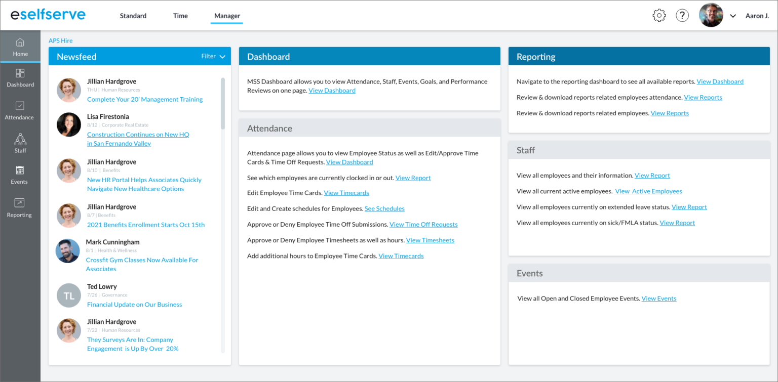
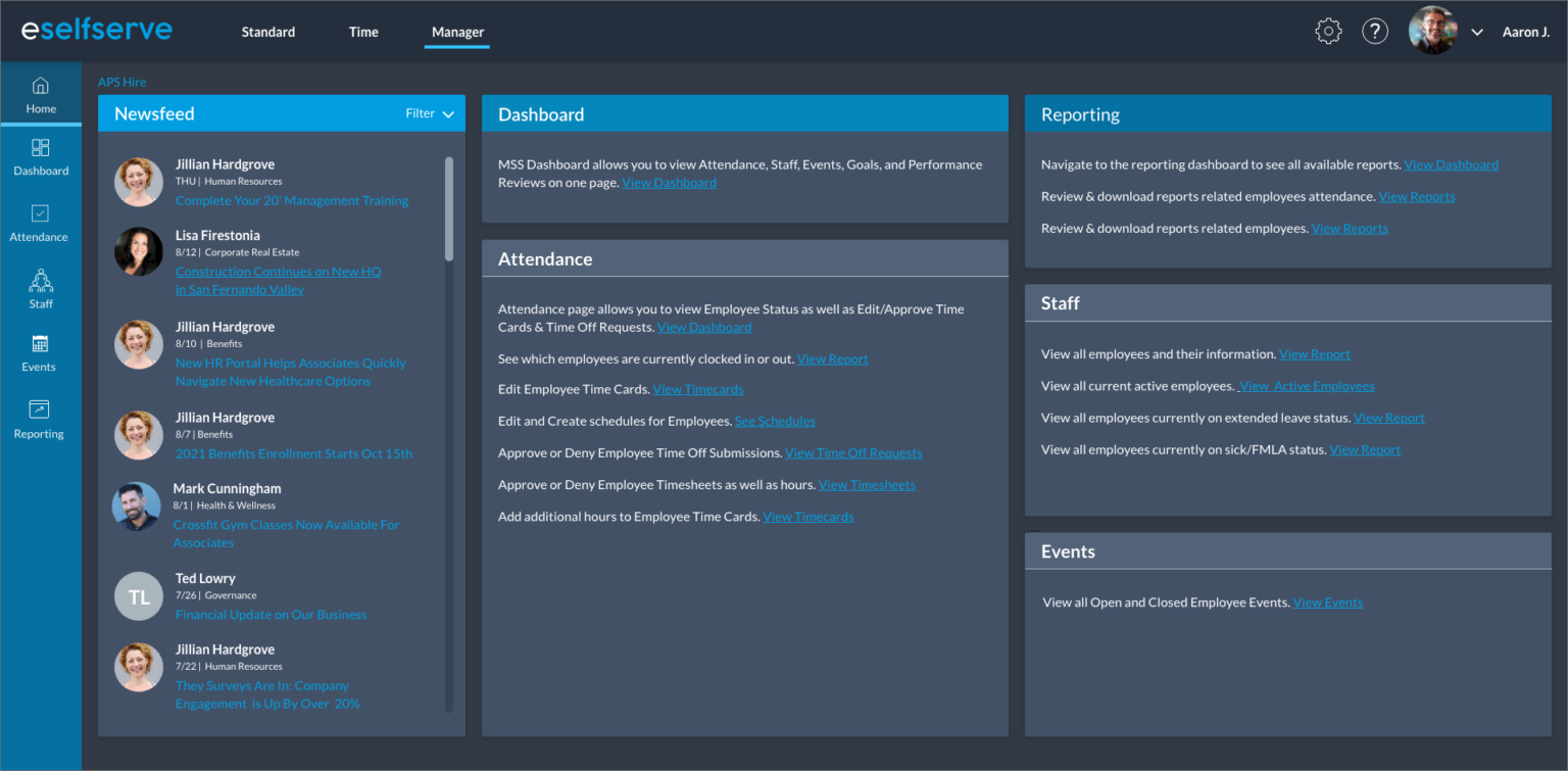
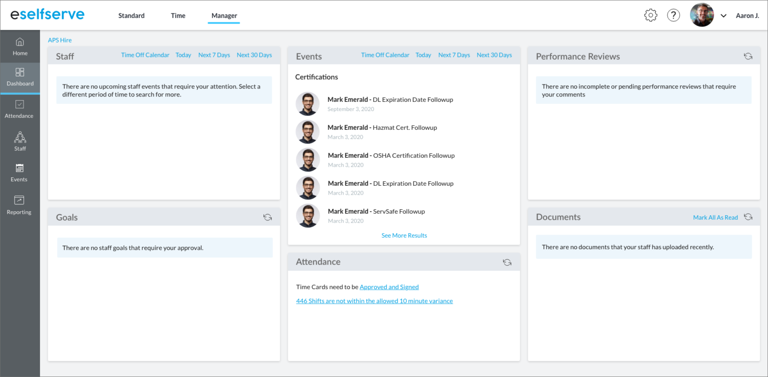
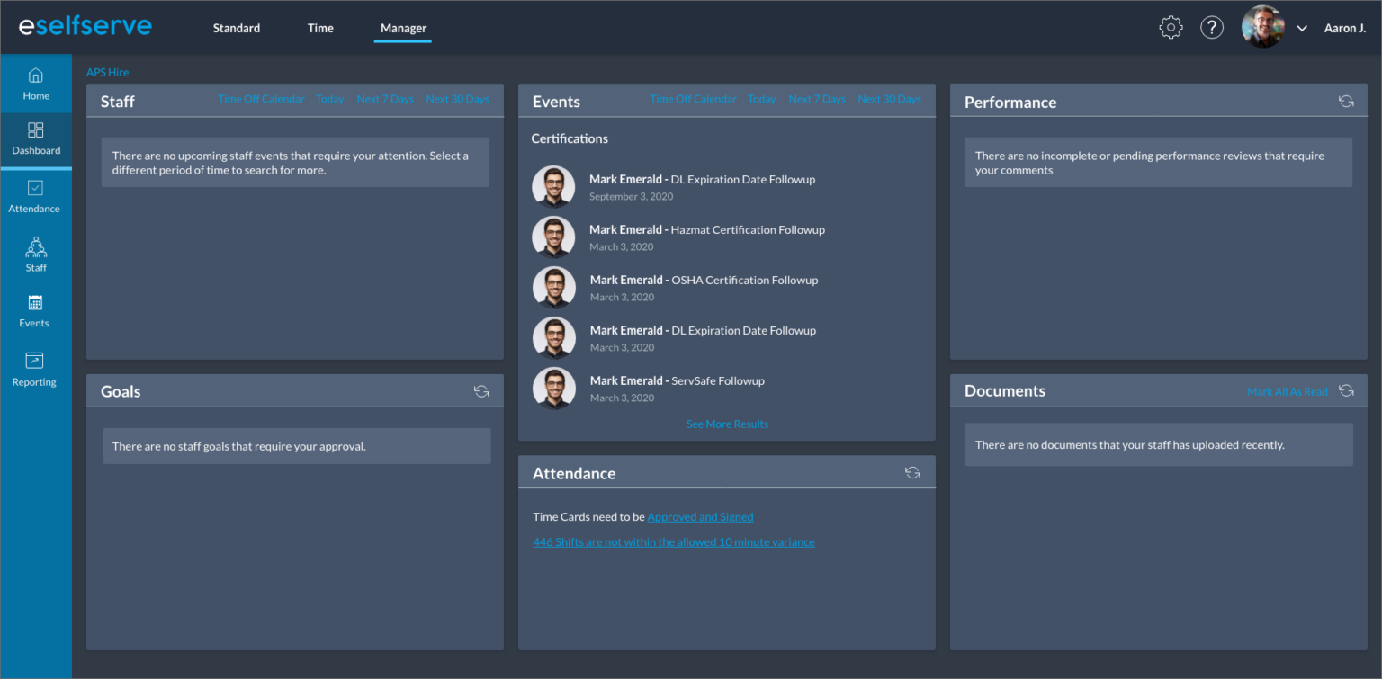
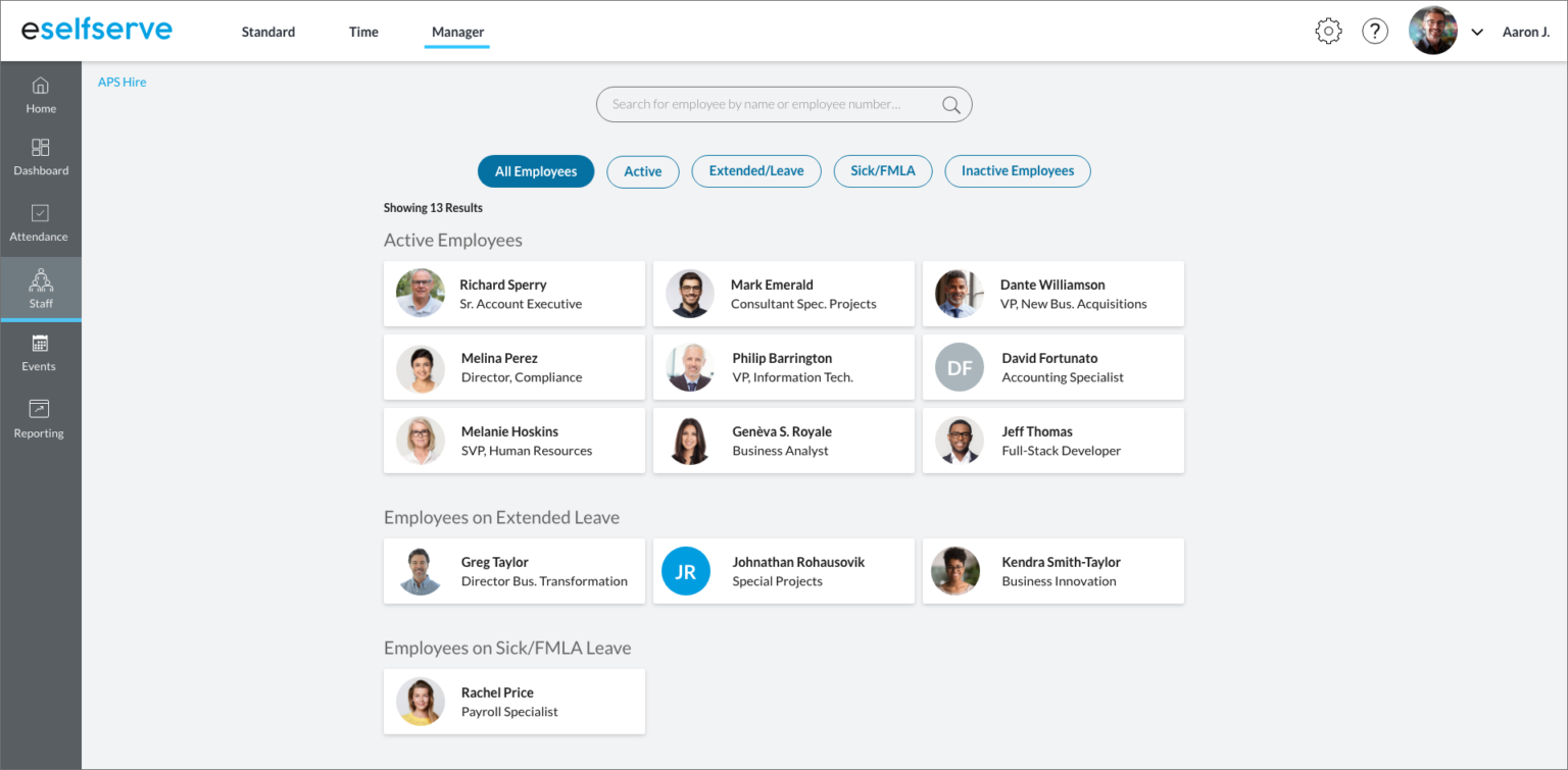
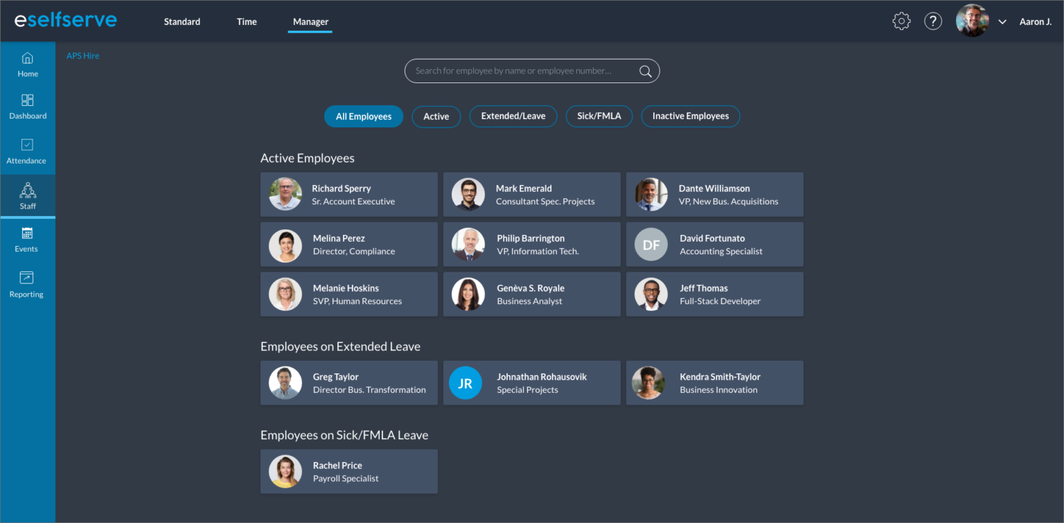
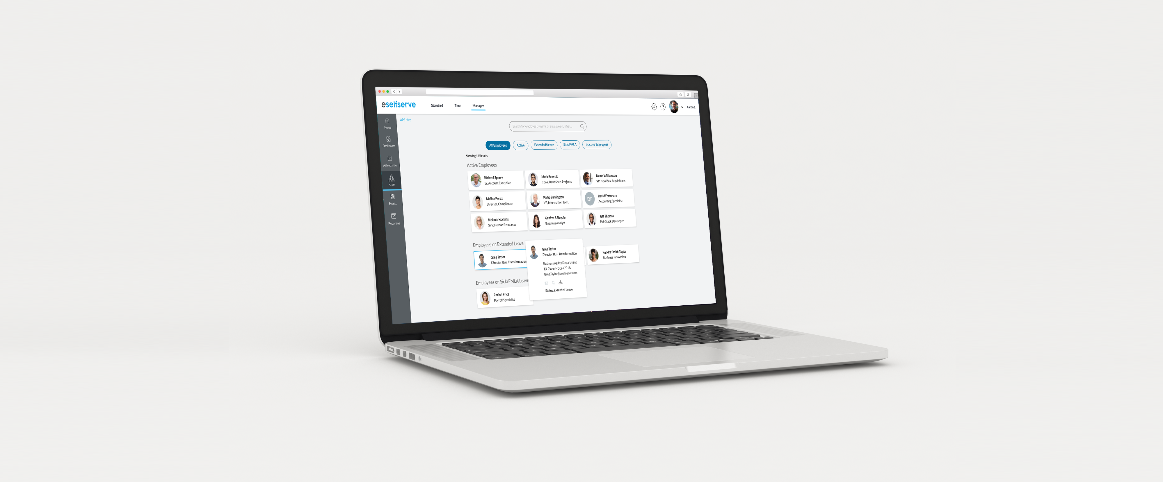
As with any new project I like to look at some other competitors in the marketplace to see if I can uncover any patterns and design trends that may be applicable to the project that I’ve been assigned. Colors, button styles, navigation setup, iconography and even font styles can play are all influenced by design trends so it is important to understand what is most popular at the time. Although most admin portals have a utilitarian purpose I don’t believe they need to look cold, uninviting or generic. Admin portals serve as a tool for users to perform a specific task or list of tasks. Since this portal would be used everyday and sometimes multiple times throughout the day it was incumbent upon me to create a design refresh that would motivate the end user to use it when necessary. 

The Design

Since I could not change much of the UX I really focused my attention on making the interface more visually appealing. For me this process included updating the logo and font choices, relocating the main navigation, adding some colors, and making more subtle changes like adding drop shadows to all of the information tiles. The goal was to create a more productive experience for the end user by making the important information more prominent on each screen.  For extra credit I even included a dark theme as part of the redesign as studies have shown that darker themes has helped to aid in user focus.  Overall the redesign turned out well and I’ve since been contracted to do some additional work for the client.