Today Card Website Redesign
My Assessment
Identifying The Problem
Before diving into the redesign of the Today card website I wanted to get an understanding of the major pain points that customers were experiencing. Throughout my research I uncovered that a significant amount of customer calls that the callcenter representatives were fielding were relating to making payments and how customers can view their credit card transactions online. The legacy iteration of the website made the task of making payments confusing and cumbersome and the transaction history was buried out of site from the customers.
The Opportunity
I felt the best way to remedy both the payments and transactions issues was to redesign the main customer dashboard. The dashboard is the first screen that a customer sees post login. The general rule of thumb is that the dashboard should have the most pertinent information relating to a customer’s account profile including: the account balance, the most recent transaction history and ways for customers to make a credit card payment without having to leave the main dashboard screen and to uncover ways for making payments easier overall for the customers.
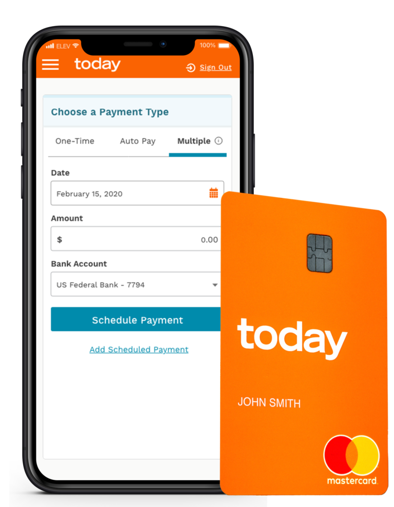
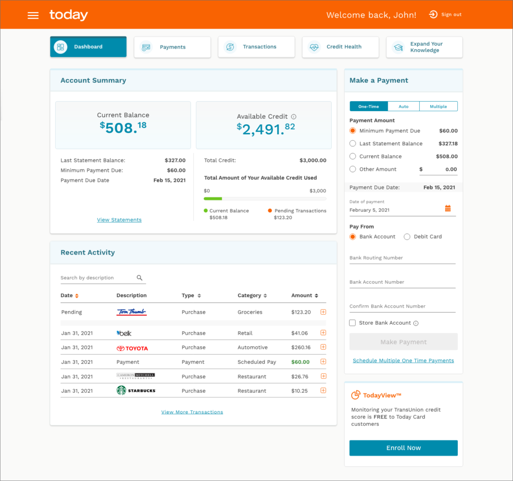
In my research I discovered that a majority of Today card customers use their mobile phones when accessing their account online. For this reason it was important for me to place some added emphasis on the mobile experience which was an area of opportunity in the past iteration of the design. One of the biggest improvements I made that tested well, was the use of logo icons in the transaction ledger. Each icon represented a different record and gave customers the ability to quickly scan their transaction history to pinpoint a specific transaction of interest. In addition to this, I added the ability for customers to view more detailed information about each transaction through the use of accordions that show/hid less important details.
New Dashboard Layout and Transaction Ledger Test
In order for me to validate that the changes I made were successful I engaged in both A/B testing of the old site versus the newly design site and some usability testing for the new make a payment flow that I created. After some initial impressions of the new site most customers who participated in the study noted that the dashboard was much less cluttered and easier to navigate. The tabbed elements appearing at the top tested really well since users no longer had to reference the hamburger menu for some of the most important menu options. They also gave positive feedback on how easy it was for them to make payments—with the redesign I was able to scale down the number of payment steps from 5 to 3 total.
Since the launch of the redesign customer engagement has increased by over 26% on the website. As a result, both callcenters have recorded a notable drop in calls relating to customer payments and complaints about not knowing where to look for their account transaction history. The new website design was well received and since then I’ve made recommendations for updates on other parts including: scheduled payments, make a payment and change the due date flows to name a few. I was very happy with the the results of my work and I hope to apply the learnings from this project to future UX work.